Sunday, June 15, 2014
Wednesday, June 4, 2014
Things You Can't Tell By Looking At Me
So, I did a video for my UI class, and it's not too embarrassing...
Wednesday, May 28, 2014
Some Thoughts on Web Standards
I’m going to try to be as concise about this as possible, since I’ve done extensive research into the area (and come across a few of these articles) before. I don’t have a smartphone or any type of mobile device, so in preparation for an early class on User Experience and Interface (UX/UI) for mobile applications, I looked into a lot of the conventions and elements that are taken for granted on smartphones, as well as the reasoning behind why they are the way they are. But I’ll get to that later. Here are my thoughts on the questions and the articles:
What are Web Standards, and why are they important?
Web standards are a series of expectations in user interface on the web. These are the things that are placed in similar, um, places across most web pages. If you want to see a website’s logo, you look to the top left corner. When you mouse over a hyperlink, if changes color (or style, or underlines, or something like that). These are all things that we assume will happen every time you open a website. Now, these types of things are important because they allow the user to get a handle on the site pretty quickly. Look at it this way; imagine if you were doing research across a couple of books. One of the books has a table of contents in the front, and you get used to using that to find chapters. But then the next book has its table of contents in the back, and every time you go to look up a chapter, you mess up and go to the front of the book by accident. It’s a pain in the butt to have to relearn basics, and web standards help prevent that.
What do I think of web standards?
I think that web standards have their place. They’re obviously a very important for usability and continuity, but quite frankly, the Internet that Jakob Nielsen describes is pretty bland. If one hundred percent of a website’s elements were standardized, there wouldn’t be any room for interesting design, or more importantly, innovation. I know he sort of calls off his dogs and admits you can’t standardize everything, but even the degree he wants standardization to is a bit harsh. Personally, I think the makeup of the web is at a pretty good place right now; a lot of sites are standardized (I’m lookin’ at you, social media), but there’s enough difference in other parts of the web to keep it interesting. And enough to give room for new ideas, maybe even future standards, to arise.
Wednesday, May 7, 2014
Wrapping Up the Semester: Mobile/Interactive Design
I don't own a smartphone, and I had never even held a tablet before this class. I had an inkling I was behind the technology curve in that regard, but it was really cemented for me when, at the beginning of the semester, the professor, Pattie Belle Hastings, had us lay out our phones on a table so we could talk about the average user profile of the room. Out of the whole class, I was the only person who didn't have a smartphone. At least it was unique.
 |
| Yes, that does say 6:32 am. Don't judge. |
From there on out, though, I had to do a lot of research to keep myself on par with the class. Even the most basic elements of apps, like menu structure and icon placement, I had to research. Personally, I think this gave me an edge, since I essentially had an excuse to really delve into the things that most smartphone users simply take for granted, learning about the design decisions that influence smartphone design. It also let me criticize the system a bit and find my own ways to do things (for better and for worse; I've never heard the phrase "This is a safe place to fail" so many times in my life!)
All told, I don't think I failed (Well, at least I hope not, since I kind of need this course to graduate in a few weeks!) I learned the most I ever have in any one class from Mobile/Interactive Design, mostly because I started out knowing so little. I feel like I was able to effectively research to make up for my technological deficiencies and come out with very strong designs and layouts. I really enjoy the field of UX/UI; it's something I would definitely consider for a career in the future. There's a nice cross-section of print design and game design in the field, it almost feels like that could be where my whole career as a designer has been headed all along!
And who knows, maybe one day I'll get a smartphone to test my own designs on :P
Tabletop - UI Prototype Demo
Here it is: the User Interface Demo of the Tabletop Game Prototyping App:
It's kind of neat to have moved the Tabletop Game Prototyping App to the UI mockup phase of development. I've become really attached to the project; it's definitely my favorite app design I've done, probably since I really think that an app like it would be an excellent tool. It's generated a surprising amount of positive feedback and interest, enough for me to consider revisiting it with a few of my programmer friends. With just a small amount of refinement, this could even be put up on Kickstarter in the hopes of generating enough funds to make it happen. Either way, I'm very happy with the way the app design has come out, and I think I've developed both a strong visual design and a strong user interface design.
Tuesday, May 6, 2014
For when you can't ask your design friends for help...
... there's "Critique that Sh••!"
If you're looking for a good laugh at the expense of your own design, ftp your project to the web and plug the url into this site. The computer gives you a nice what-for!
If you're looking for a good laugh at the expense of your own design, ftp your project to the web and plug the url into this site. The computer gives you a nice what-for!
Wednesday, April 30, 2014
Tabletop App Paper prototyping
I tried something new with this prototype. Unlike my previous one, where I used a whole new screen for each menu, submenu, etc., I tried separating out the menus and just placing them over the background screen to simulate ho the app would actually work. Now, I did run into a few issues; about midway in I admit that I forgot to print a menu, and the "back" button from the Playtest screen is mysteriously missing. But, it did let me show off the "drag and drop" elements of the app in a paper prototype environment, which I'm kind of proud of. In my defense, I did try to keep the number of screens to a minimum so that I could just add menus on top, but clearly some of navigation fell by the wayside (or to the floor when I was trimming).
Next time I do this, I have to lay it all out and go through it a few times myself, that way I don't have any embarrassing little hitches in the layout. Also, using some basic color might help; just watching the video, I can see the whole thing is very gray (between the table and the paper prototypes).
Special thanks to Nick for being the user, Jason for filming, and Ninjamock for being a sick tool.
Wednesday, April 23, 2014
Tabletop Game Prototyping - UI Mockups
The project continues! These are mockups of what the User Interface for the Tabletop app will (might) look like. I tried to give it a look that wasn't specifically geared towards RPGs and Fantasy games, but definitively themed. I won't lie, I drew a lot of inspiration from Card Hunter's UI and the inner workings of Roll20, at least for an idea for styling.
You might notice a definitive lack of 3D in these comps. That doesn't mean that the app doesn't feature 3D, it just means that the comps are all of screens looking at the view top-down :P
Also, I have more developments (such as an elevator pitch and a marketing idea) on my concurrent blog, Little Game Tweaks.
 |
| Home Page |
 |
| Open Project |
 |
| Edit |
 |
| Add Asset |
 |
| Playtest |
Wednesday, April 2, 2014

Wednesday, March 26, 2014
iPad App Development, Phase I: Researching the Idea
I could give you some spiel about how there are no new ideas, but let's face it; you've heard it before. Even the phrase "nothing the under the sun" is terribly cliched. Coming up with new ideas is tough, but you have to try hard, be creative, and most importantly, do your research, to be as original as possible.
This all holds doubly true for apps. As I've been looking into iPad and tablet apps, I've realized that any schmuck with some basic programming skills can make an app, and while they might not all be good ones, the ideas are still out there. Here are some ideas my research turned up:
This all holds doubly true for apps. As I've been looking into iPad and tablet apps, I've realized that any schmuck with some basic programming skills can make an app, and while they might not all be good ones, the ideas are still out there. Here are some ideas my research turned up:
Need It/Got It
College kids, especially Freshman, find themselves unable to go shopping and get their hands on some things that they might normally want at school. At the same time, they end up with plenty of things they end up not needing or wanting. The goal of this app would be to connect the two ends together.
Need It/Got It is an app focused on setting up small-scale trades between college students, say a box of mac and cheese for some batteries. It would provide an easy space for students to post and search for things they might need and make an offer to whoever has it. There could even be a space for "want it," for longer term listing of larger items, like games or textbooks.
Now, I understand that Craigslist is a thing, but it has some real image issues and has no focus. Need It/Got It would be different in that it would be geared toward students at a particular college (and wouldn't host creepy listings. It would also use a shorter timescale; the goal would be for trades to be executed within an hour of posting.
Competitors for the app would be the aforementioned Craigslist, as well as the hard-to-track-down "swap-meet" type app Anttenna (their site has gone dead). Catering to college kids will set Need It/Got It up and apart from the competition.
Unnamed Jam App (Marmalade?)
Forming a band is tough; you have to find a group of people who can get along well enough to make and play music together. Unnamed Jam App seeks to remove that aspect. Users of this app would log in when they want to make music, and be placed into a jam session with other musicians based on preferences (users can set their genre preference, as well as how willing they are to play with other users of different genres). The users can then use the tablet to share music, lyrics, and chords to jam together from wherever they are.
The premise of this app would be anonymous, near-random groupings of musicians collaborating on a single song together. While there would be options for contacting your grouping afterwards (to share a recording, perhaps), that wouldn't be the focus.
There are tons of apps meant to help musicians jam, especially over distances. Garageband, eJamming, and Ninjam allow for musicians to connect and record over distances, but not randomly or anonymously. This app would aim to be different because it connects you with musicians you don't know, which can lead to some awesome, unexpected music.
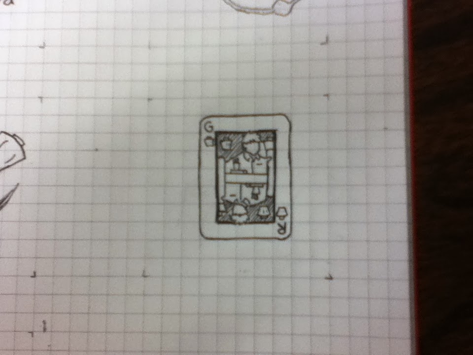
Card Table
This app is a card game platform based around the idea of a virtual tabletop. Nearby users would be able to play games together, sharing the "tabletop" of their tablets while being able to have a hand of cards. Users would be able to create custom cards using an in-app editor, or use pictures to create cards (similarly to the Pop App).
The inspiration for this app comes from programs like OCTGN, a computer program that allows users to play custom card games online, but with a focus on interface and mobility. It could be an excellent tool for game designers, allowing them to test custom card games (with possible options for board games?) easily and in a simple to use format.
My research brought up some copyright issues that a program similar to OCTGN ran in to. Based around the card game Magic: the Gathering, the program Cockatrice (now taken down) used loaded images of the cards and violated the company's copyright. This app could get around that by not coming preloaded with anything besides a basic set of cards, but still allowing users to take their own pictures for personal use.
Wednesday, March 19, 2014
Errands App Walkthrough
Well, here's the big moment. This is a walkthrough of the Errands To-do List App Redesgin I've been working on. A special thanks to inVision for creating the online prototyping tool I'm using to preview the app.
If you're interested in trying the app out yourself, you can access it on the web here, or, if you have an iPhone with Safari, you can visit and download a preview version of the app (essentially what is shown in the video, but on your phone!) using this URL: http://invis.io/M6PY132X. Comments are enabled, so feel free to leave feedback!
If you're interested in trying the app out yourself, you can access it on the web here, or, if you have an iPhone with Safari, you can visit and download a preview version of the app (essentially what is shown in the video, but on your phone!) using this URL: http://invis.io/M6PY132X. Comments are enabled, so feel free to leave feedback!
Sunday, March 16, 2014
Drawing in SVG, or What I Did With My Spring Break
Today, or rather over the course of the past week, I learned the value of knowing some javaScript in web design. I don't know much (right now), but even the little bit I know at least gave me the confidence to fiddle around with some scripts and jQuery to try and make it work.
So what was I trying to do? Well, this: Codrops Demo. Or this: Vox media review of the Polygon site
I thought that maybe I could have my little whiteboard wanderer character be drawn into the page, and have the rest of the page fade in around him. Seemed simple. Until I fell down the rabbit hole.
The fun thing about that Codrops article is that they don't really tell you how it's all done. They tell you what the effect is, how it's used, and where you can see it, but it's more of a "look how cool this is" than a "let me show you how to do that."So, I found myself picking away though the source files, which look something like this:
And that's just the HTML source, mind you. There were three JS sources and three CSS sources to deal with as well. It was a bit of a maze for me. It's not that it was confusing, I understand the way that JS works, but there was just a lot for me to process and untangle. After I picked around through it for a bit, I decided to see if someone else had already. So I poked around the internet and found this article:
Jake Archibald Animate Line Drawing
Which was exactly what I was looking for. It was all about using CSS styles and JS to draw SVGs, specifically how. Essentially, you create a dashed line along the path of your drawing, with the spaces between the dashes as big as the dash itself. Then, you just shrink the gap, giving the illusion of the line being drawn.
Seeking further clarification, I found an article by the same author, further explaining the technique: 24 Ways animating vectors. This article was a little more recent, and easier for me to understand. After I worked my way through the whole article and thought I had a grasp of the concept, I prepared to buckle down for some JS coding. I would need to open up my SVG and convert it to line points, then plug those points into the html. Using a javaScript function, I would tell those lines to "draw" by adjusting their stroke offset (using a 'for' loop), and then tweak it till it looked nice.
And that's when I noticed a link to this little gem at the top of the comments section for the LazyLine Paitner Method. Now, generally I don't like to associate myself with something labeled "Lazy," but this was a prebuilt JS function that did everything I was trying to do.
So, I downloaded the demo file and began to pick that apart. It didn't take too long to get my little shape being drawn up in HTML, though it did take a good amount of tweaking to get it right (I'll post a tutorial on it later, specifically one geared toward people with little JS experience). Here's what I ended up with:
http://mywebspace.quinnipiac.edu/gtrava/gregRava%20Site/index.html.
Until next time!
So what was I trying to do? Well, this: Codrops Demo. Or this: Vox media review of the Polygon site
I thought that maybe I could have my little whiteboard wanderer character be drawn into the page, and have the rest of the page fade in around him. Seemed simple. Until I fell down the rabbit hole.
The fun thing about that Codrops article is that they don't really tell you how it's all done. They tell you what the effect is, how it's used, and where you can see it, but it's more of a "look how cool this is" than a "let me show you how to do that."So, I found myself picking away though the source files, which look something like this:
 |
| Which, after some research, this makes sense to me |
And that's just the HTML source, mind you. There were three JS sources and three CSS sources to deal with as well. It was a bit of a maze for me. It's not that it was confusing, I understand the way that JS works, but there was just a lot for me to process and untangle. After I picked around through it for a bit, I decided to see if someone else had already. So I poked around the internet and found this article:
Jake Archibald Animate Line Drawing
Which was exactly what I was looking for. It was all about using CSS styles and JS to draw SVGs, specifically how. Essentially, you create a dashed line along the path of your drawing, with the spaces between the dashes as big as the dash itself. Then, you just shrink the gap, giving the illusion of the line being drawn.
Seeking further clarification, I found an article by the same author, further explaining the technique: 24 Ways animating vectors. This article was a little more recent, and easier for me to understand. After I worked my way through the whole article and thought I had a grasp of the concept, I prepared to buckle down for some JS coding. I would need to open up my SVG and convert it to line points, then plug those points into the html. Using a javaScript function, I would tell those lines to "draw" by adjusting their stroke offset (using a 'for' loop), and then tweak it till it looked nice.
And that's when I noticed a link to this little gem at the top of the comments section for the LazyLine Paitner Method. Now, generally I don't like to associate myself with something labeled "Lazy," but this was a prebuilt JS function that did everything I was trying to do.
So, I downloaded the demo file and began to pick that apart. It didn't take too long to get my little shape being drawn up in HTML, though it did take a good amount of tweaking to get it right (I'll post a tutorial on it later, specifically one geared toward people with little JS experience). Here's what I ended up with:
http://mywebspace.quinnipiac.edu/gtrava/gregRava%20Site/index.html.
Until next time!
Wednesday, March 12, 2014
Awesome Man and the Minimal Interface!
Near the end of my sophomore year of college, I was part of a three-man team working on a game called "Awesome Dude and the Maze of Doom." It was a short game, only one level long, for a game design course meant to teach us how to program for Flash Actionscript 3.0. I drew the short straw and became our programmer (the group consisted of two graphic designers and a business professor; none of us were, at the time, equipped to be programmers), and quickly began to teach myself Actionscript. Of course, the program and language is going the way of the dodo, but that doesn't mean everything I learned is obsolete.


One of the enduring lessons I learned as part of the project was just how little information you can get away with giving a user. You see, we were faced with dilemma of teaching our player how to play a game that they'd only be playing for a few minutes at most (the "speed run" of the game clocked in at 0:52:23, a record I set, thank you very much). If the tutorial took too long, it would seem kind of silly in regard to the rest of the game; if the tutorial was too short, players might end up unsure of what to do. So, the three of us brainstormed and brainstormed, and did our research, until we worked out a short tutorial sequence to show the player everything Awesome Dude could do in around 10 seconds.
But of course, nothing ever goes as planned. I couldn't get the tutorial video to flow into the game properly, and our production schedule didn't leave much time to troubleshoot in that direction. So, we went back to the drawing board. We needed a way to teach players in-game, unobtrusively. What we came up with was not only a more interactive, but overall much more effective, method.
We used the up-to-that-point blank space behind the character, the "walls" of the maze, to show the players the controls as they needed to use them.
I'm not claiming this is an innovation; many flash games online use the same technology. It's just something we hadn't considered, since we had a lot to teach the players. We tried to keep everything as simple as possible; everything was depicted visually so players didn't need to process text. We tested extensively to see just how little we could get away with.
So, how does this relate to UI/UX? Well, the same principles apply. Ever since Awesome Dude, I've been of the philosophy that you should keep the "tutorial" aspect of your UI to a minimum; everything should be explanatory and intuitive. Icons should make sense. Pages should flow naturally. A good number of people might disagree with me, but I think that users are intelligent; if things make sense, they can figure it out with minimal effort. Sure, it takes a lot of testing and trial on the part of the UI designer, but it results in a better UI experience in the end.
Friday, March 7, 2014
Building the Site
I'm going to cut right to the wireframes, since my post here covered a good portion of the conceptual side of this. I have three directions I'm working with: fat sidebar, perspective menu, and drawn animation.


Each of them has their own pros and cons. The one I'm most concerned with is the perspective menu, which is also one of my favorite effects. The whiteboard wanderer icon is the link that pulls up the menu, but I don't want to have to hook him up with a neon light halo to convey that. A mouse-over animation might be able to get the job done, but I'm not sure. I'm going to go ahead and develop it, and we'll see where it goes with some user testing.
I also made some basic mockups of each:
 |
| fat sidebar - gallery |
 |
| perspective menu |
Website Effects
I like cool websites. I don't find them too much on my own (most of my web browsing consists of reading articles, which tend to exist on pretty straightforward sites), but when I do, I make note of them. So it was that bookmark folder I looked in as I began to plot out my portfolio site.
After some searching and a little help from a friend, I came across Codrops. The rest of my day was completely absorbed. I have a tendency to go on tutorial binges, and this was one of my most productive. I don't want to build my entire portfolio site using material from Codrops, but it might happen.
So here's what I found.
First up is the first tutorial on the site: a stack gallery. It's a simple, but fun, transition for a gallery that takes the images and shuffles them around. Maybe it just appeals to the part of me that likes playing Magic, but I think it' an interesting effect to fancy up a part of the site that would otherwise just have a boring old transition. I'm not sure that this is necessarily what I need for my site; it doesn't necessarily fit in with the whiteboard theme.
 |
| The demo of the effect |
 |
| The codrops guy really likes green |
 |
| The animation effect mid-transition |
 |
| the scale back and rotate object. it could give a cool effect as if it were a whiteboard! |
Deliberate Practice
I don't do nearly enough research outside of projects. Some of my design friends will spend hours looking through Behance, deviantArt, or Dribbble, percolating ideas and admiring work, but that's not me. Don't get me wrong, when it comes to doing projects, both personal and professional, I'm all over the place researching, looking at ideas and inspiration. But in my downtime, I find it difficult to sift through it all.
Of course, if I do want to get better at design research, I need to practice.
And as always, the things I read manage to shame me. One of the sections in the 99U book Maximize Your Potential, is all about building your expertise. One article in particular, Developing Mastery through Deliberate Practice, scolded me fairly effectively. "Practice undeniably lies at the heart of mastery," it reads. This isn't anything new to me; as a guitar player for six years now, I've seen the value of practice and the improvement it yields. Heck, if you want to see the value of deliberate practice, look at the harmonica, which supposedly takes only ten hours to 'master.' I've put the time in on that, and it shows. I want to be a designer more so than a guitarist or a harmonica player, so I need to put in the work to prove it.
So, if I want to hone my creative mind, I have to start taking the deliberate practice to my design. One thing I've done toward that end is something I've taken to calling "tutorial binges." These are like the productive side of a Netflix binge, when I come across a neat tutorial on a site, I do it. Then, I hop to another one on that site and do it, and so on and so on, etc., etc. I've spent hours on sites like Tuts+ or the tutorial section of Creative Bloq, trying out little techniques and styles I can use in my projects. It's an ongoing process, and I won't be able to tell how much it helps until years down the line when I can hopefully look back and see improvement.
But rather than a corny line, I'll leave you with my favorite gif
(courtesy of colleghumor.com)
Wednesday, March 5, 2014
Paper Prototyping with Friends
Getting hands on with the Errands redesign! A prospective user does a guided run-through of the app on my paper prototypes.
A special thanks to Reid for being the unsuspecting user, and to Carl for filming on his phone, that way the whole thing didn't look like it was coated in vaseline.
Monday, March 3, 2014
Hands On Prototyping
I love it when design becomes hands-on. Computer are great and all, but there's just something so satisfying about using your hands! (This is part of the reason why I'm so in love with whiteboards , but that's another rant for another day). So it makes sense that the paper prototyping aspect of UI design really appeals to me. It's a chance to get the mockups off the computer and into the hands of users.
I've found that when you paper prototype UI, you need to have good mockups. One of my favorite tools for this (back from when I was a wee lad designing UI for business student's apps last year) is NinjaMock. This has really everything you could ask for in an UI mockup app: it's simple to use, has all of the system pre-made UI elements, allows you to import your own images, and can export as a printable pdf. And most importantly, it's free (at least for three projects). Okay, that's enough of a plug for that.

So, I've printed out my mockups at fairly the right size (one of the downsides of the program is that when you go to print, it makes them nearly 8.5x11) and trimmed them properly (it's amazing how your trimming skills improve with time after you've cut out 36 screens of an app). I'm currently working on getting some users to handle the screens. I'll post some videos with results in a bit!
I've found that when you paper prototype UI, you need to have good mockups. One of my favorite tools for this (back from when I was a wee lad designing UI for business student's apps last year) is NinjaMock. This has really everything you could ask for in an UI mockup app: it's simple to use, has all of the system pre-made UI elements, allows you to import your own images, and can export as a printable pdf. And most importantly, it's free (at least for three projects). Okay, that's enough of a plug for that.
So, I've printed out my mockups at fairly the right size (one of the downsides of the program is that when you go to print, it makes them nearly 8.5x11) and trimmed them properly (it's amazing how your trimming skills improve with time after you've cut out 36 screens of an app). I'm currently working on getting some users to handle the screens. I'll post some videos with results in a bit!
Friday, February 21, 2014
Multitask! Multitask! Multitask!
I used to think I could multitask. Back in the 6th grade or so, I remember "simultaneously"drawing, watching TV, and doing homework. Of course, I really wasn't doing all that at once, but I was certainly trying. All the work got done in the end, so I figured I could keep on "multitasking." I usually kept it down to just watching tv and doing homework, but I did it all through high school.
Recently, I've gotten about half way to kicking the habit. Now that all my work has to happen on the computer (save the sketching parts), my workstation is the same as a huge source of entertainment. The Internet, Netflix, and tons of articles are just one 3-finger swipe and two clicks away. It's so easy to get distracted by a thought and end up on browsing the internet. Sometimes I'll even run a Netflix show I know well, like Bob's Burgers or Archer in the background and just listen to the show as I work. I say that I need the "background noise" to work, but that's not really the case. When I work in the Campus Life Office, I often work in silence, or just with music, and that's when I'm at my most productive.
Of course, these are terrible habits that I need to break. One of the books recommended to me: 99u's "Manage Your Day-to-Day," has a whole section on focus and breaking what psychologist Christian Jarrett calls the "multitasking myth." His article is about the way we lose our flow when we lose our focus and multitask, since we aren't really doing two things at once, but bouncing quickly back and forth between two things. Any time we turn our attention away from the task at hand, we fall down a "rabbit hole" of distraction.
The biggest issue for me lies in the fact that I need to use a computer to do a good portion of my work. "Even if you have cast iron willpower," Jarrett writes, "the mere fact that the internet is lying in wait on your computer takes a toll on your work performance." We have to do our work on machines that are the gateway to distractions, it's likely we'll end up there at some point.
So what am I doing to fix this? Well, for starters, I've taken to shutting off the wifi on my computer when I have to get work done. This doesn't alway work, since I do need the internet for some of my work, but it does help me to focus. I've also begun weaning myself off of Netflix with music and podcasts (particularly This American Life, an NPR podcast). Since there are no visuals, I'm not nearly as tempted to change my focus to it fully, I can just half-listen to it as I work. I'm a work in progress, but I'm definitely improving.
Friday, February 7, 2014
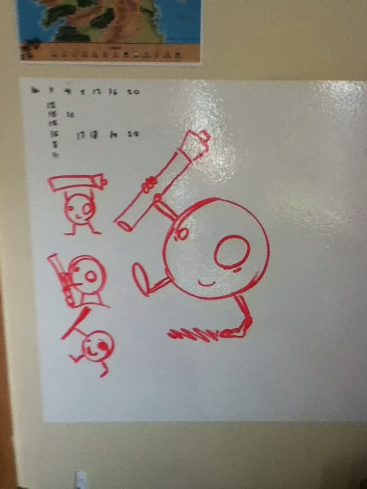
Logo - First Drafts
 |
| We have a winner! |
So I took him to the whiteboard for a little work:
 |
| excuse the camera quality; it's an old iPod I'm using... gotta get a camera |
Wednesday, February 5, 2014
Errands Usability Report
It was a lot easier to get people to do an app walkthrough than I had thought. Originally, I thought I was going to walk into the radio station (my go-to place for finding people, since I'm the General Manager and I command some respect there :P), ask for some people to run through the app for me, get a few blank stares and lame excuses, and then have to try somewhere else.
Instead, I got three willing participants almost immediately. I couldn't have gotten a better mix if I had chosen people specifically, either. There were two who use to-do lists, one who doesn't; mac and pc users, and tech users of different levels.
Honestly, the hardest part of the process was keeping up with my users. They tore through the app, for the most part, and I didn't want to ask them to slow down (that would muddy the results a bit, in my opinion). Getting them to explain outloud to me what they were doing definitely helped, but I'm sure I missed some data. Next time, I need a video!


Personas Revised
After some feedback on my initial personas, I found out I had a lot of work ahead of me. I went back to the research board (is that a thing?), and dug up a few more articles about the creation of personas, specifically what they were supposed to entail. This site gave me some good insights, especially in the humanization department. The biggest issue for me was that I hadn't fleshed out my persona enough... she was just a collection of vague user stats in the shape of a hypothetical girl named Wendy. Sure, she had a background, but I hadn't deemed it necessary to delve too far into her life. She was just an acquaintance. So I decided to use a technique I learned from a writing book back when I was so keen on writing fiction in high school.
I took her out to dinner, and we hit it off. She told me a lot about her life: growing up the youngest of three, the car accident that wrecked her leg in Sophomore year, her resolve to become a nurse after her time in the hospital. She was very open about her time in college, and how she partied so hard her first year that she nearly flunked out. She managed to turn her grades around after, but at the expense of her social life.
I liked her, but in the end, it didn't work out; she had too much to do between her work and education (and so do I, I suppose), and it turned out she was older than I thought (her age went up by three years since the last time I checked) but I had learned everything I needed. I reworked her, and this is the result:
Friday, January 31, 2014
Sketching Time!
I love sketching. I've always been a doodler; quite a few of my notebooks from high school are more doodle than notes! That's part of the reason I love being in a design program... the teachers rarely yell at you for doodling :P
So I started on my logo sketches, first on the white board wall stickers I have in my room:


So I started on my logo sketches, first on the white board wall stickers I have in my room:
The blog title sort of hints towards my love of whiteboards, but I've found that they are amazingly helpful. I realized it when Ira Fey, possibly the best Game Design teacher, held Skype interviews with professionals in the field. Four of the five designers had huge whiteboards in their rooms (yeah, I kept track), so naturally, I took notice. Having a huge writing surface readily available has come in handy for me more than once, I highly recommend it. If you need to be convinced, I'd suggest you read this article.
But I digress, back to the logo sketches:
After the concepting, I put ink to paper in the most painstaking process ever! Pens bug me out, since once it's on paper, that's it. Not pictured are the three pages of mistakes.
Mindmapping
I've been mindmapping for years without knowing it. I first learned the skill in Game Design, when we were laying out ideas for our first big game, "Awesome Man and the Maze of Doom." Now, we called it brainstorming, but it was a very similar concept. A big, blank whiteboard and some markers, and we plotted out the whole concept over the course of a few days (with minimal unintentional erasures), and that helped us to cement what we were doing.
Fast forward three years (God, has it been that long?) and I'm beginning to think about putting together my portfolio. Pattie Belle introduced the concept of the mindmap to us a diagram form of the brainstorm, a physical bit of proof of ideas. Along with providing us with plenty of examples of mindmaps, she introduced us to the concept of creating one to keep track of project ideas. An extended brainstorm, you might say, as you keep it going over a long period of time.
Now, I wanted to create my mind map on a whiteboard in one of the classrooms, but fate intervened in the form of an eraser while I wasn't there (to be fair, I left for more than an hour). So, until I can get in front of a whiteboard unimpeded, I turned to NovaMind to create the Mindmap on computer.

Such as this one! (Update 2/7/14)
And there's a lot of restructuring that needs to occur...

Fast forward three years (God, has it been that long?) and I'm beginning to think about putting together my portfolio. Pattie Belle introduced the concept of the mindmap to us a diagram form of the brainstorm, a physical bit of proof of ideas. Along with providing us with plenty of examples of mindmaps, she introduced us to the concept of creating one to keep track of project ideas. An extended brainstorm, you might say, as you keep it going over a long period of time.
Now, I wanted to create my mind map on a whiteboard in one of the classrooms, but fate intervened in the form of an eraser while I wasn't there (to be fair, I left for more than an hour). So, until I can get in front of a whiteboard unimpeded, I turned to NovaMind to create the Mindmap on computer.
This is by no means finished; as a matter of fact it's only beginning. This article from Mind Tools explains that, unlike the brainstorm, the mind map continues on for the life of the project, always expanding.
Expect to see plenty more (and better looking versions) of these!Such as this one! (Update 2/7/14)
And there's a lot of restructuring that needs to occur...
Subscribe to:
Posts (Atom)